Streamlining the Path to Purchase: Event Discovery to Seat Selection
2023
Project Overview
With the first venue launch approaching, Cosm needed to bring its mobile-only event discovery experience to the web, maintaining the app’s intent while elevating its visuals for a wider audience.
In this project, I adapted the existing mobile flow for web, enhancing the journey from event discovery to checkout. I also led a complete redesign of the seat map experience, ensuring it was both visually engaging and intuitive for desktop users.
My Role
Product Designer
Collaborators
Ethan Paulson, Director of Product Design
Marcus Valverde, Senior Software Engineer
Mike Schiro, Web Product Manager

The goal of this project was to ensure the website could fully support ticket sales as demand grew, offering users a smooth and intuitive purchasing flow. While the app already handled transactions, we focused on creating a web-first experience for users who preferred not to download another platform.
By collaborating closely with stakeholders and developers, I helped deliver a solution that was both accessible and efficient, giving every user a clear path from event discovery to purchase.
Defining Core Design Features
The event exploration experience needed to be intuitive, visually clear, and scalable. Since the original flow was designed for a mobile-first app, our focus was on adapting it for desktop while taking advantage of the larger screen’s layout flexibility.
- Retain the efficiency of the mobile-first flow while optimizing the desktop experience with clearer layouts and contextual guidance.
- Enhance the ticketing process with educational touchpoints that help users make informed purchase decisions.
- Create an adaptive seat map that dynamically adjusts to different venue layouts, making seat selection simple and intuitive.
Focusing on these goals allowed us to create an experience that felt cohesive across platforms and easy for users to navigate from event discovery to checkout.

01 Adapting the Ticketing Flow for Web
Building on the existing app flow, we optimized the web experience by using the larger screen space on desktop and tablet to enhance user understanding and streamline the purchasing process. The first step in this flow was the Calendar page, where users could explore upcoming events at Cosm.
Because this page played a key role in discovery and decision-making, I collaborated closely with stakeholders and developers to ensure complex features like categories and calendar filtering were delivered accurately in the first phase. Regular design critiques helped refine layouts and component behavior, ensuring users could easily find events relevant to them and move smoothly into the purchasing process.


From the Calendar, users moved into the Event Detail page, where key ticketing information and event metadata were presented upfront to minimize extra clicks and improve clarity. Essential details such as event type, show duration, and age restrictions helped users quickly determine if an event matched their interests, reducing decision fatigue and maintaining momentum toward checkout.

02 Helping Users Understand Ticket Variations
Cosm’s venue offers multiple ways to experience an event, from different floors to unique ticket types, but users often struggled to distinguish between seating options, pricing tiers, and inclusions. To solve this, we focused on presenting information more clearly and contextually to make comparisons intuitive.
- Venue Experience Selection: Users could now choose between Hall or Dome seating before entering the seat map.
- Ticket Tiers & Pricing Indicators: Visual cues such as $, $$, and $$$$ were added alongside ticket descriptions to simplify decision-making.
By adding clarity and visual structure, users could easily compare options and confidently select the experience that best matched their preferences.


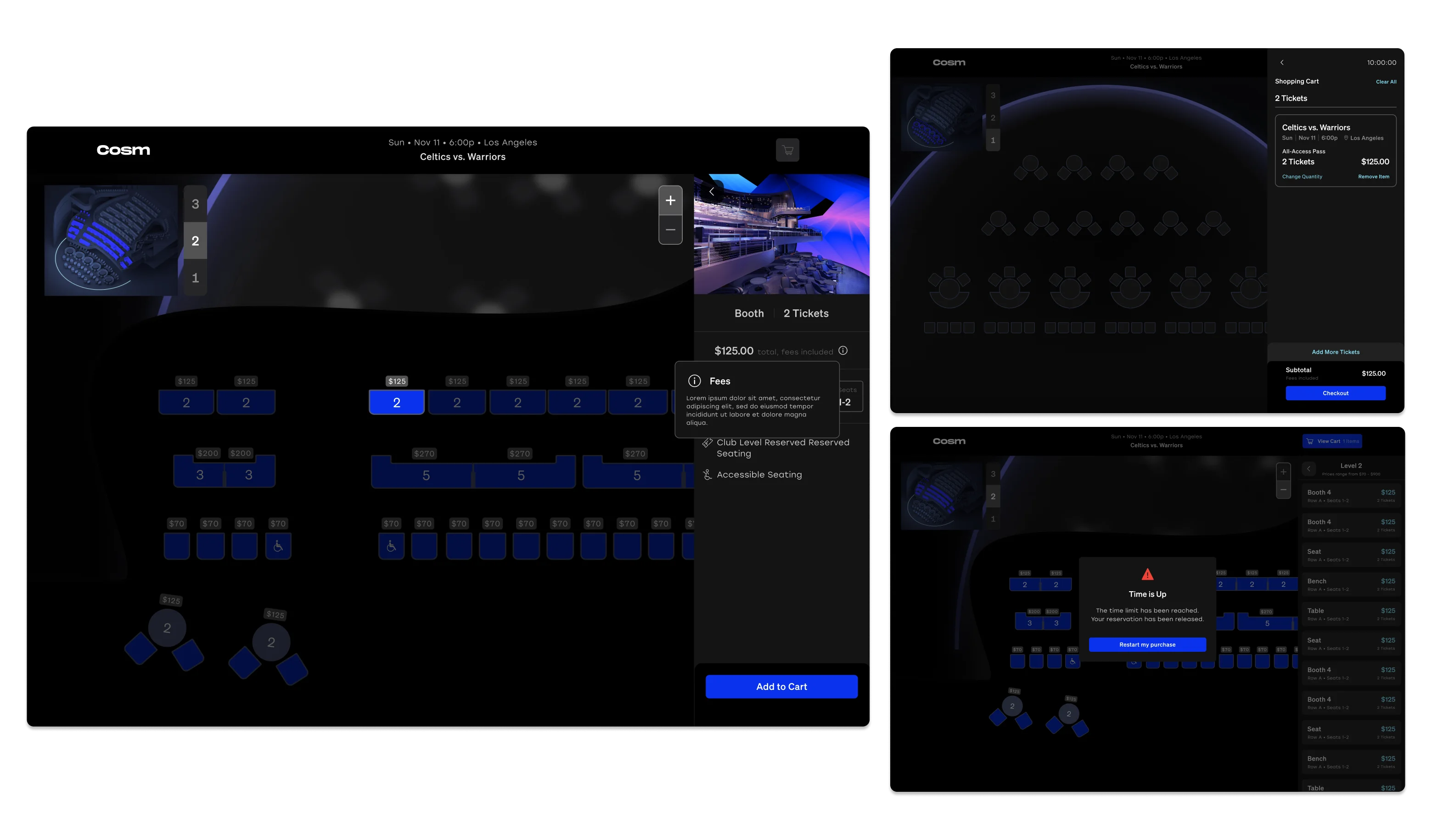
03 Designing the Seat Map Experience
An intuitive seat selection process was central to the overall user journey. Working with our content designer, I refined the seat map to improve visual clarity, making the venue’s layout, screen placement, and seating structure easy to understand at a glance.
To enhance usability, I designed components for each seat type and state, reflecting real-world configurations. Through regular design critiques with stakeholders, we refined the approach to balance user needs with business goals. I also introduced a mini map to help users stay oriented while switching floors and selecting seats.
Close collaboration with developers ensured the final build remained faithful to the design while staying technically sound and user-friendly.


The optimized web experience strengthened event discovery and streamlined ticket purchases. Enhancing filters and presenting key details upfront reduced friction and increased user engagement. The refined seat selection process improved orientation, reduced confusion, and led to higher conversion rates.
This project reinforced my ability to design for scalability, manage complex design systems, and collaborate effectively across teams. Working closely with developers and stakeholders, we delivered a ticketing flow that was both technically sound and intuitive for users.

With the experience now live, we’re positioned to build on what we’ve learned and continue improving the ticketing journey:
- Refining pre-purchase education: Enhancing onboarding screens to better guide users before seat selection.
- Adjusting seat map visuals: Aligning the digital layout more closely with the physical venue to increase user confidence.
- Continuing user research: Running usability tests and gathering feedback to fine-tune the flow based on real customer behavior.
By iterating on this foundation, we can ensure the ticketing experience continues to evolve in clarity, accuracy, and engagement.